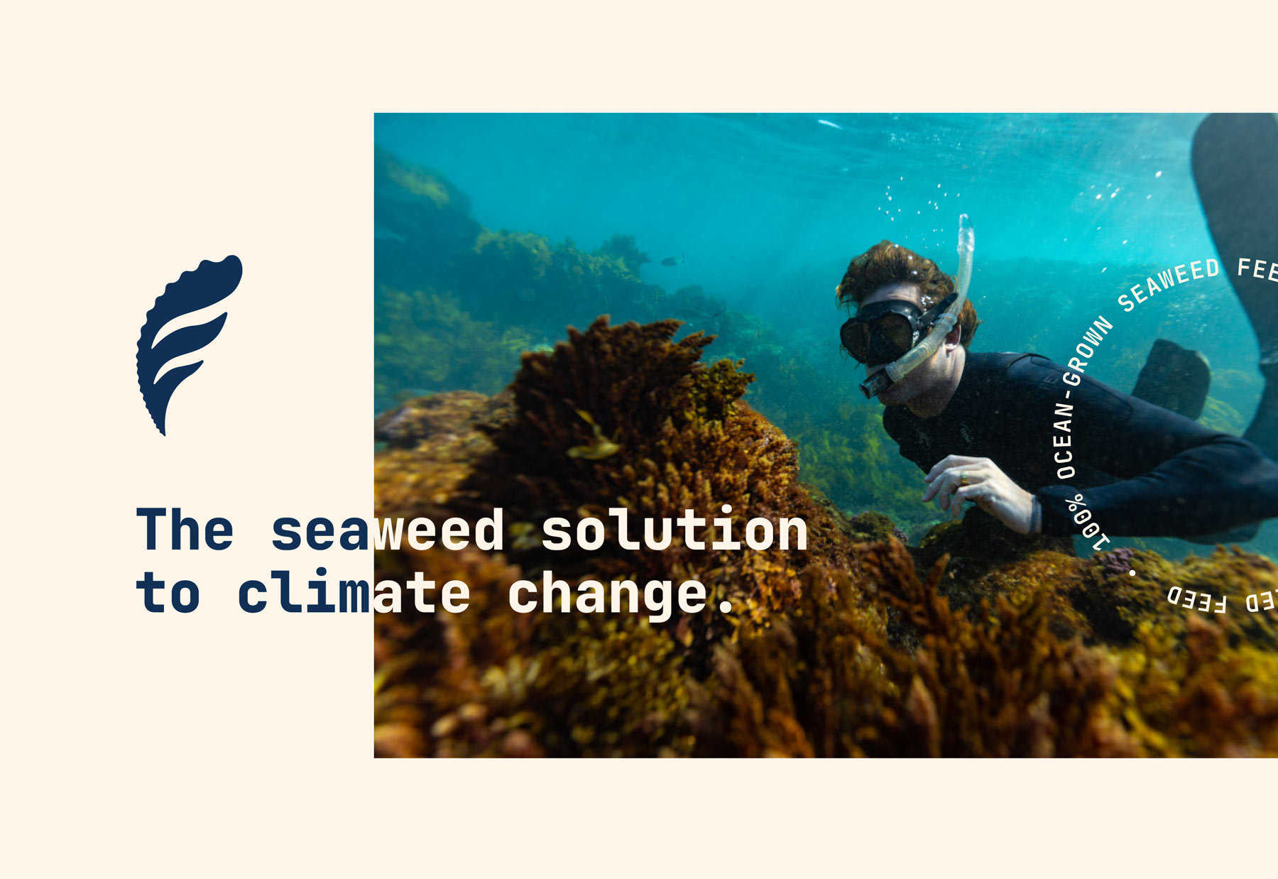
Fremantle Seaweed is a distinctive blend of playfulness and sincerity, creating a refreshing, positive tone within sustainability. This intentional approach injects approachability while addressing the gravity of sustainability issues with a serious undertone. Drawing from a lifetime of experience on the ocean, Fremantle Seaweed embodies a deep sense of care and understanding in its advocacy. This authentic connection resonates throughout the brand, crafting a narrative beyond mere eco-consciousness.
How we do it
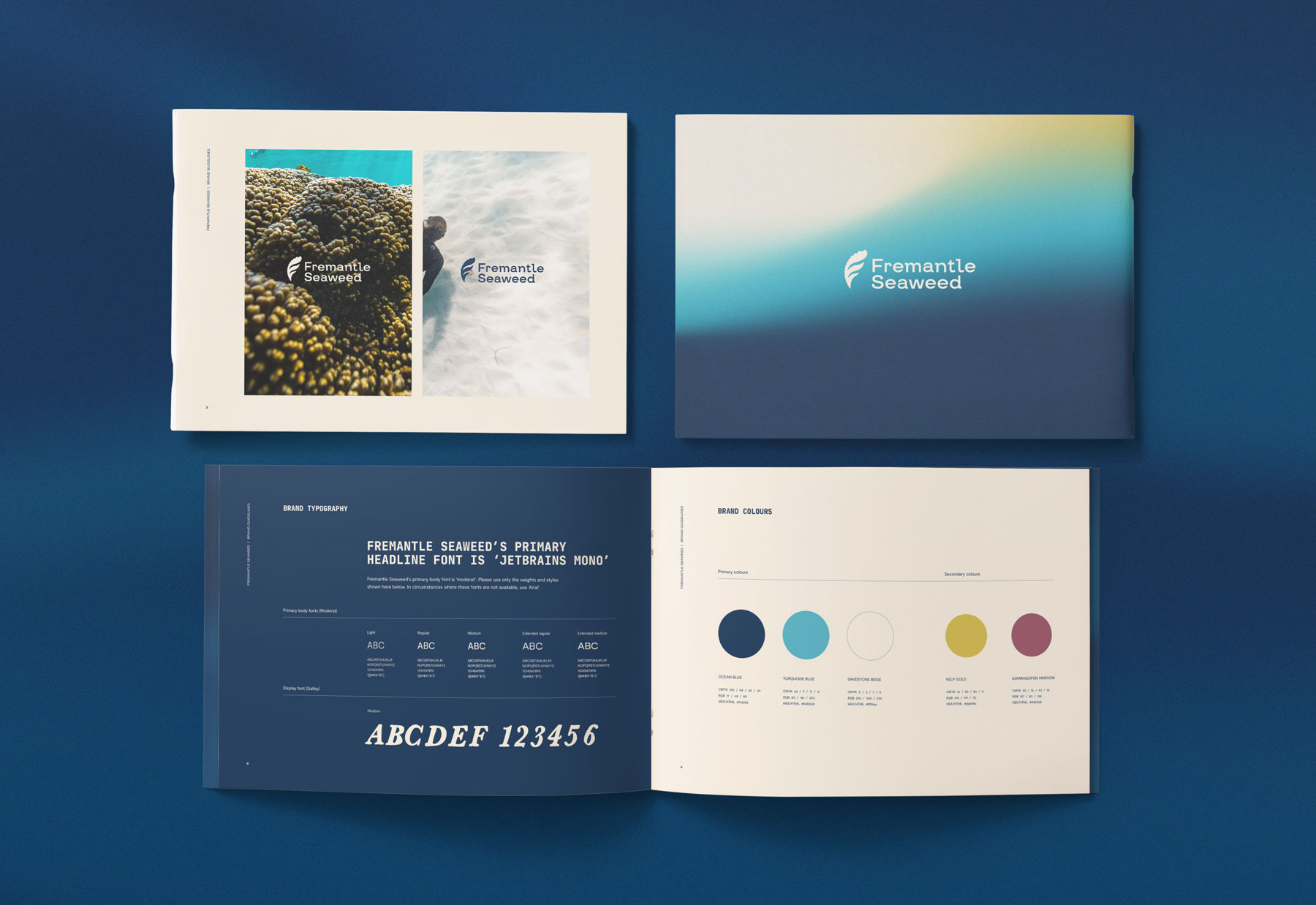
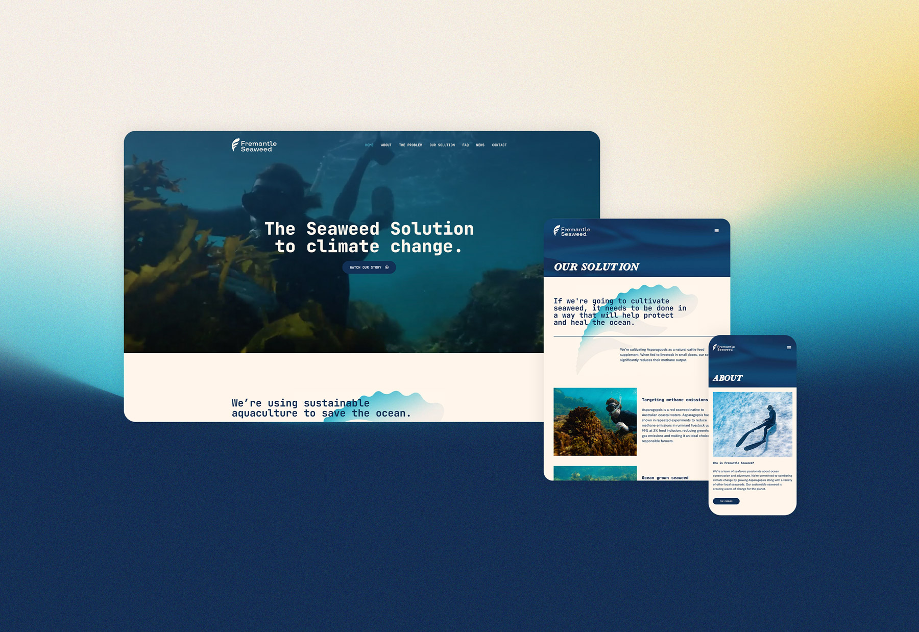
We approach every project the same way – with equal parts strategy and creativity. we bring concepts to life creating brand identities and websites that tell compelling brand stories.